🌐 Also available in: 🇪🇸 Español
Original source: Universidad de Palermo
This video from Universidad de Palermo covered a lot of ground. Streamed.News selected 8 key moments and summarises them here. Everything below links directly to the timestamp in the original video.
Could it be that the most effective design is precisely what appears simplest at first glance? The experience of the Argentine Central Bank suggests that well-executed "obviousness" can be synonymous with durability and cultural relevance.
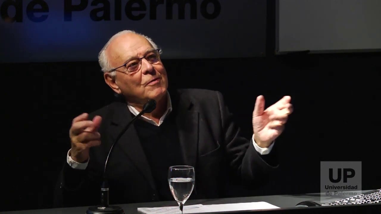
Rubén Fontana praises the "obvious" redesign of the Argentine Central Bank
Rubén Fontana has been recognized for his redesign of the logo of the Central Bank of the Argentine Republic, a work the speaker describes as a masterpiece. Rather than pursuing forced originality, Fontana chose to refine a pre-existing historical symbol: a 19th-century bas-relief from Argentina's first one-peso coin, depicting the sphinx of the Republic. This decision — which involved cleaning up the icon and stripping away superfluous elements such as laurel wreaths — was celebrated for its rigor and its ability to preserve inherent symbolic validity, despite objections from other designers who dismissed it as "too obvious."
The project underscores the argument that, at times, the most straightforward and conventional solution is also the most fitting — particularly when it is grounded in a rich cultural heritage and fulfills its communicative function with clarity. The reintroduction of a double circle around the institution's name, a classic format in banking and monetary logos, reinforces the notion that it is not always necessary to reinvent the wheel. This intervention not only revitalized the symbol but also reaffirmed the importance of legibility and contextual relevance in institutional design, emphasizing that creativity lies not in novelty for its own sake, but in the achievement of functional and symbolic perfection.
"Rubén Fontana is a great designer — extraordinarily creative — who doesn't get lost in the foolishness of fearing the obvious. He understands that, in certain cases, the obvious solution is the right one, and this is a masterpiece that will endure forever."
The power of the obvious recognized in iconic brands like Exxon and 'I Love NY'
Internationally renowned brands such as Exxon, Anís del Mono, and the iconic "I Love NY" are presented as paradigms of design whose effectiveness lies precisely in their obviousness. Far from pursuing originality at all costs, these brands employ graphic and typographic elements that communicate their purpose directly and unambiguously, often drawing on universal and instantly recognizable visual cues. The widespread admiration for these cases stands in sharp contrast to a prevailing tendency within the design world to reject simplicity in favor of complexity — a contradiction the speaker characterizes as a "perverse" or "psychopathic" discourse.
The critique points out that, while the clarity and impact of these historic examples are celebrated, many contemporary designers fall into what is called the "dialectic of prejudice," dismissing the obvious as a lack of creativity. This phenomenon reveals a disconnect between professional aesthetic judgment and mass audience perception — audiences that value immediacy and effortless comprehension. The argument is that true mastery lies not in stylistic sophistication but in the ability to craft messages that transcend cultural and cognitive barriers, as demonstrated by these works of "universal graphic heritage."
"Nobody questions it, everyone admires it — but no one draws the proper conclusions. It is admirable precisely because there is not a single trace of arbitrariness. It's obvious. Even the illiterate can read it."
Mannerism in design is trumping usability, warns Norberto Chaves
A troubling trend has taken hold in the design world, where the pursuit of "originality" and an aversion to the "obvious" lead to solutions that compromise functionality and clarity. This inclination toward mannerism manifests across a range of everyday objects — from the illegibility of text in books laid out with excessively small typefaces, to dysfunctional cylindrical faucets impossible to grip with soapy hands, to architectural doors that conceal their hinges, leaving users confused about which way to push or pull. The critique highlights how this "perversion" of design places the creator's stylistic imprint above the essential service the product must render to its user.
This "horror of the pedestrian" — or taboo against the obvious — blocks the adoption of simple, clear, and decisive solutions in favor of an ambiguity that is, ironically, perceived as a mark of sophistication. The phenomenon, which the speaker illustrates with reference to Jacques Tati's film Playtime, reveals a fundamental disconnect between design's core purpose — meeting a need and facilitating interaction — and a practice that has drifted toward artistic self-expression. Rather than prioritizing communicative efficiency and usability, a significant strand of contemporary design becomes mired in contrivances that obscure the message and complicate users' lives, exposing a fundamental failure in its understanding of what it means to design.
"There is a kind of horror of the pedestrian — of the obvious, the simple, the clear, the direct. And so a whole series of operations emerge aimed at 'euphemizing' the message."
"Fear of the obvious" is a design paranoia driven by a misguided concept of creativity
"Fear of the obvious" is described as a "paranoia embedded in the DNA of many designers" — an affliction that paralyzes them when confronted with simple, straightforward solutions. This phobia, passed down through generations, is identified as a side effect of a flawed understanding of innovation and creativity, one that prioritizes originality over excellence. In a world saturated with imperfection, true creativity, according to the perspective presented, lies in the ability to do things "well, and if possible, perfectly" — tailored with the "atypicality that need demands," without any obligation to "do things backwards from the norm."
The Apple case illustrates this tension: the brand launched with a disruptive logo — a bitten apple, a bold move for a technology company — only to later return to an icon of "total obviousness," a universally recognizable pictogram. This strategic shift, which the speaker describes as an act of "lucidity" on the part of both designer and client, demonstrates that originality can be a tool for generating impact, but that clarity and normalcy are often the ultimate goal. The closing reflection challenges designers to move beyond the biases that "pile up like slabs on the brain" and prevent quality design from taking shape, in favor of pragmatic and functional solutions.
"The fear of the obvious — there is a kind of paranoia embedded in the DNA of many designers that stops them, paralyzes them in the face of the obvious, precisely because of a misunderstood notion of innovation and creativity."
Obviousness is key to brand identification for country brands and central banks, expert argues
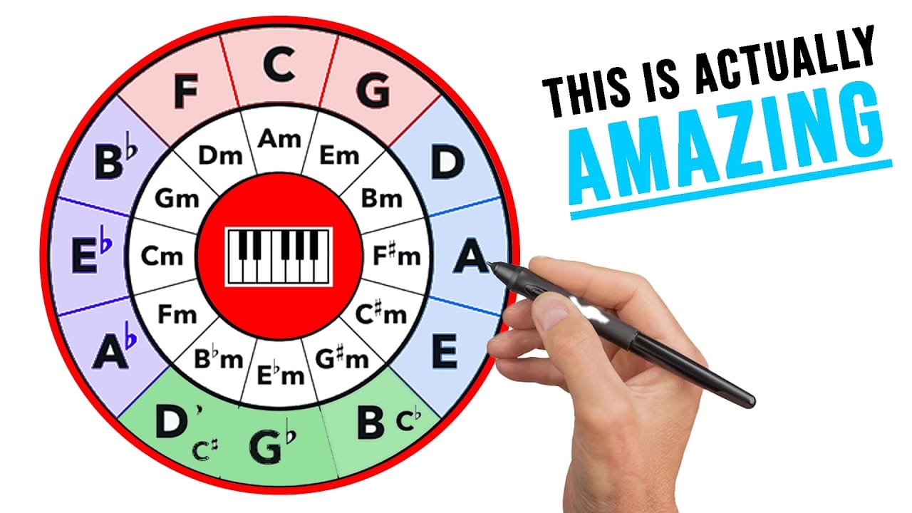
The pursuit of excessive differentiation in the visual identity of institutions such as central banks or "country brands" is, in practice, unnecessary and counterproductive. Simply identifying a Central Bank by the name of the country and the words "Central Bank" is sufficient — no graphic sophistication is needed to set it apart from its global peers, as demonstrated by a comparative study of Latin American and European banks. Similarly, for country brands, the national emblem or the country's name are powerful and instantly recognizable identifiers, with the national flag serving as a clear and effective example in currency systems and signage.
The insistence on "finding a fifth leg on the cat" or overcomplicating the design of these identities is identified as an "error of obviousness" that leads to ineffective and often absurd outcomes. Identification in these contexts, it is argued, happens "at speed" and targets "allied audiences" who already possess prior knowledge. The "obvious" choice is therefore the "correct" one for identification purposes, as it eliminates ambiguity and enables immediate recognition — challenging the premise that all design must be innovative or distinctive at any cost, especially when its primary function is clear and unambiguous representation.
"Why overcomplicate things when the obvious is the right answer? The obvious choice in identification is the correct one, because in this case identification happens at speed — it is aimed at audiences that are already on your side."
Chile's brand redesign draws criticism for letting the pursuit of originality distort national identity
The redesign of the Chile brand has become a textbook case of how an obsessive pursuit of originality in design can end up distorting a country's identity. What began as an "honest idea" — incorporating the star from the Chilean flag — was transformed, according to critics, into a "perversion" that undermined the original symbol. This process, which the speaker characterizes as a form of "corporate second-guessing" common in country branding, reveals how many designers, in their eagerness to avoid the "obvious," end up producing incoherent or ineffective results.
The central objection is that rather than retaining the "frontal star" as a clear and recognizable element, a stylized, "tilted" representation was chosen — based on the misguided premise that a conventional star would be "too obvious." This "fear of the obvious" leads design and architecture professionals to believe their mission is to do things "differently from ordinary people," overlooking the fact that the simplest, most direct solution is often the most effective. The recommendation is unambiguous: designers must apply an "antidote to the phobia of the obvious," understanding that in many cases the "obvious solution is the most correct" and that they should neither fear the straightforward nor hide behind client demands to justify poor design.
"In some cases, the obvious is the most correct choice — don't be afraid of it. And there's always someone who tells you, 'you know what the problem is — when you do something well, the client says: and you're going to charge me that much for this?'"
Design lacks internal principles and its only goal is perfection for its mission
It is argued that design, at its core, lacks intrinsic principles and is defined exclusively by its ends. The only "principle" governing it is that the designed object must be "perfect" for the specific mission for which it was conceived. This perspective corrects the mistaken notion that design must inherently be "creative, original, disruptive, and innovative" indiscriminately — ideas that, according to the speaker, act as "toxins" that lead professionals to "commit absurdities" without clear purpose. True creativity does not lie in novelty per se, but in the ability to optimize a product for its function.
To illustrate this, the example of a surgical syringe is presented. A creative industrial designer in this context would not seek a "Solomonic" or aesthetic form for the instrument, but would instead focus on reducing material use to a minimum without compromising structural integrity (given its disposable nature) and ensuring that its use is entirely intuitive and effortless for the nurse. This approach underscores that "creativity" must always be "oriented toward the problem to be solved" — serving as an "a posteriori of a program" that interprets a need, rather than an "a priori" governed by universal aesthetic demands. The key, therefore, is the designer's "modesty" in understanding the need, defining the challenges, and executing a design that meets them with rigor and effectiveness.
"Design has no principles — only ends. The one principle is that the object be perfect for whatever it was designed to do."
Design's "psychopathy" is rooted in planned obsolescence and its misapplication
The "psychopathy" or "perverse discourse" of design — manifested as a "horror of the obvious" — is not an isolated phenomenon among designers or educators, but rather a "secondary effect of a structural condition" in society. This condition is anchored in the concept of "planned obsolescence," which drives the constant turnover of products by devaluing their "symbolic value" rather than their functionality. The problem arises when this logic of competitive innovation, native to consumer markets, is inappropriately extrapolated to domains that require no constant renewal — such as the design of central bank logos or cultural identities.
An analysis of central banks across Latin America and the world reveals a "total distortion": institutions that are "unique and non-competitive" — since their role is to regulate a country's currency and financial life — are nevertheless "thrust into the innovation circuit" as though competing in a commercial marketplace. This decontextualized application of consumer dynamics leads to a pursuit of "novel" and "original" designs in contexts where stability, clarity, and institutional representation should take precedence. The result is a "breakdown" that undermines the essential function of these symbols — to communicate with authority and permanence — rather than adapting to market trends.
"This psychopathy is a secondary effect of a structural condition in our society. That structural condition can be summarized in one concept we all know: planned obsolescence."
Also mentioned in this video
- Speaker corrects his talk title to 'The Horror of the Obvious', noting… (0:05)
- The concept of 'horror of the obvious' in design, illustrated with… (0:43)
- Speaker uses 'Sony' brand as an example of 'obvious' yet successful design… (6:13)
- Speaker presents BNP Paribas brand as an example of 'euphemism' in design… (9:16)
- Speaker shares a personal anecdote about the obviousness of a birthday cake… (16:04)
- Speaker explains that biases persist despite reality… (30:36)
- Speaker emphasizes that most people prefer believing over thinking, and that… (34:57)
- Speaker quotes the MoMA director, who wished the museum's changes would… (47:23)
Summarised from Universidad de Palermo · 49:36. All credit belongs to the original creators. Streamed.News summarises publicly available video content.